Coca-Cola's bold new look is reminding everyone of the same thing

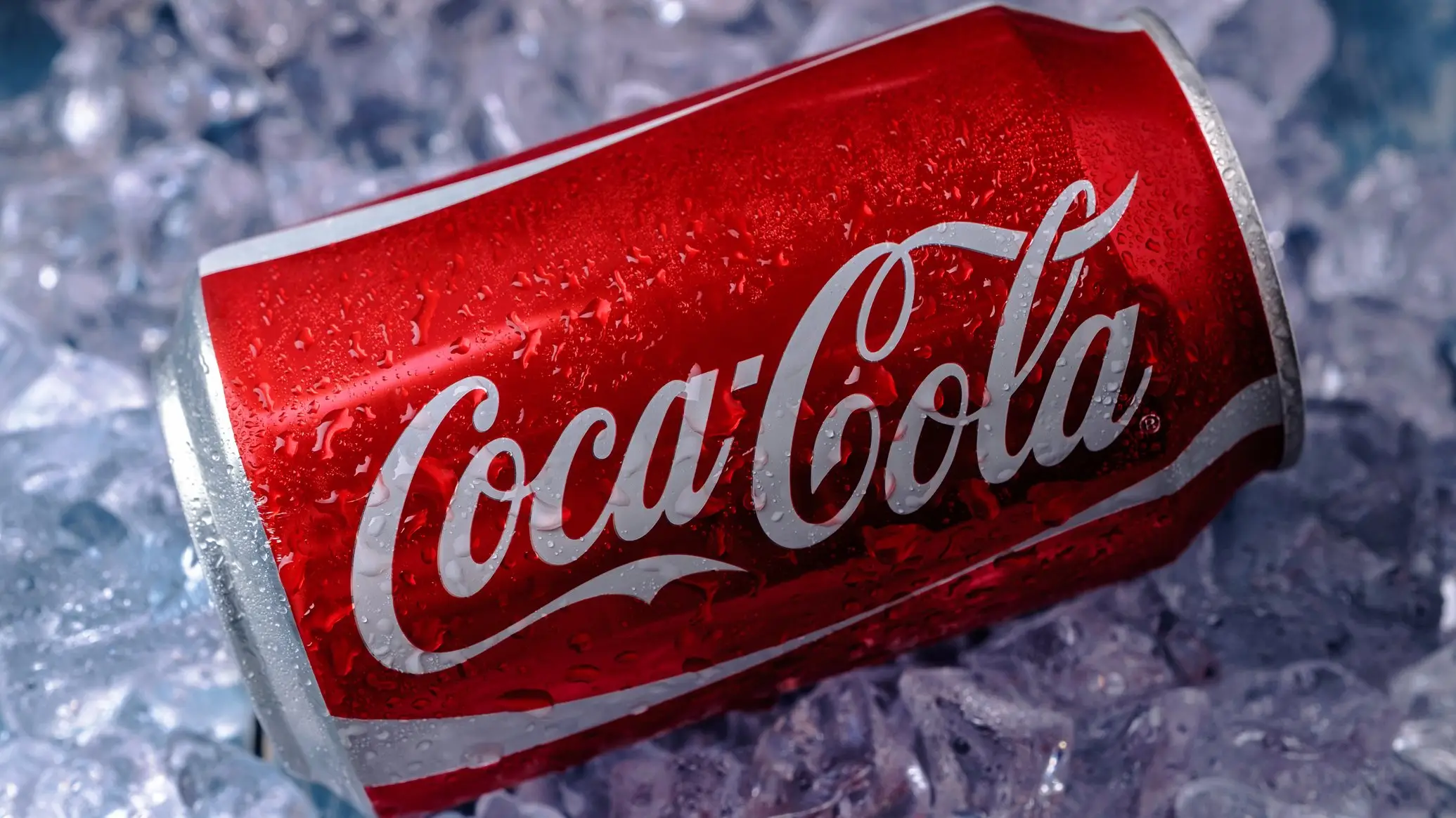
Coca-Cola has unveiled a new global visual identity, but the company’s attempt to create a more consistent look has left many people thinking of something else entirely.
As explained in the company’s press release, the updated system will be introduced across more than 200 markets and used on packaging, retail displays, equipment and digital platforms.
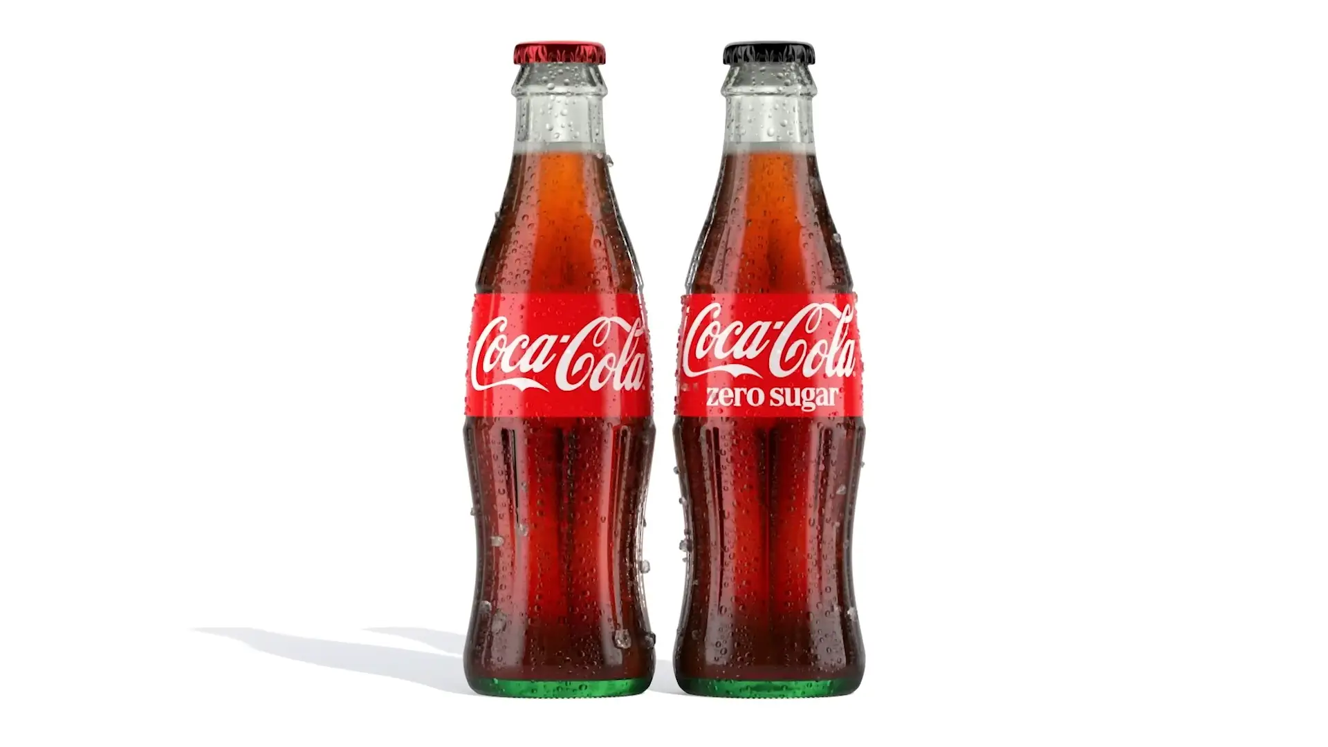
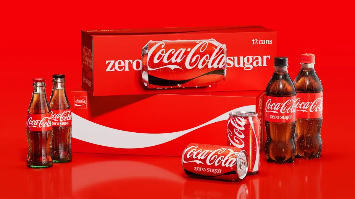
Several of the drinks giant’s most recognisable features remain in place, including its red and white colour scheme, Dynamic Ribbon, Arden Square and Spencerian script. Coca-Cola Zero Sugar is also being updated with larger ‘Zero Sugar’ wording, a black Dynamic Ribbon on cans and black caps on plastic bottles.
Advert
The company says the changes are intended to make every Coca-Cola product feel unmistakably part of the same brand. However, one newly prominent design element has quickly become the main talking point in the online space, with users saying it resembles something extremely familiar.
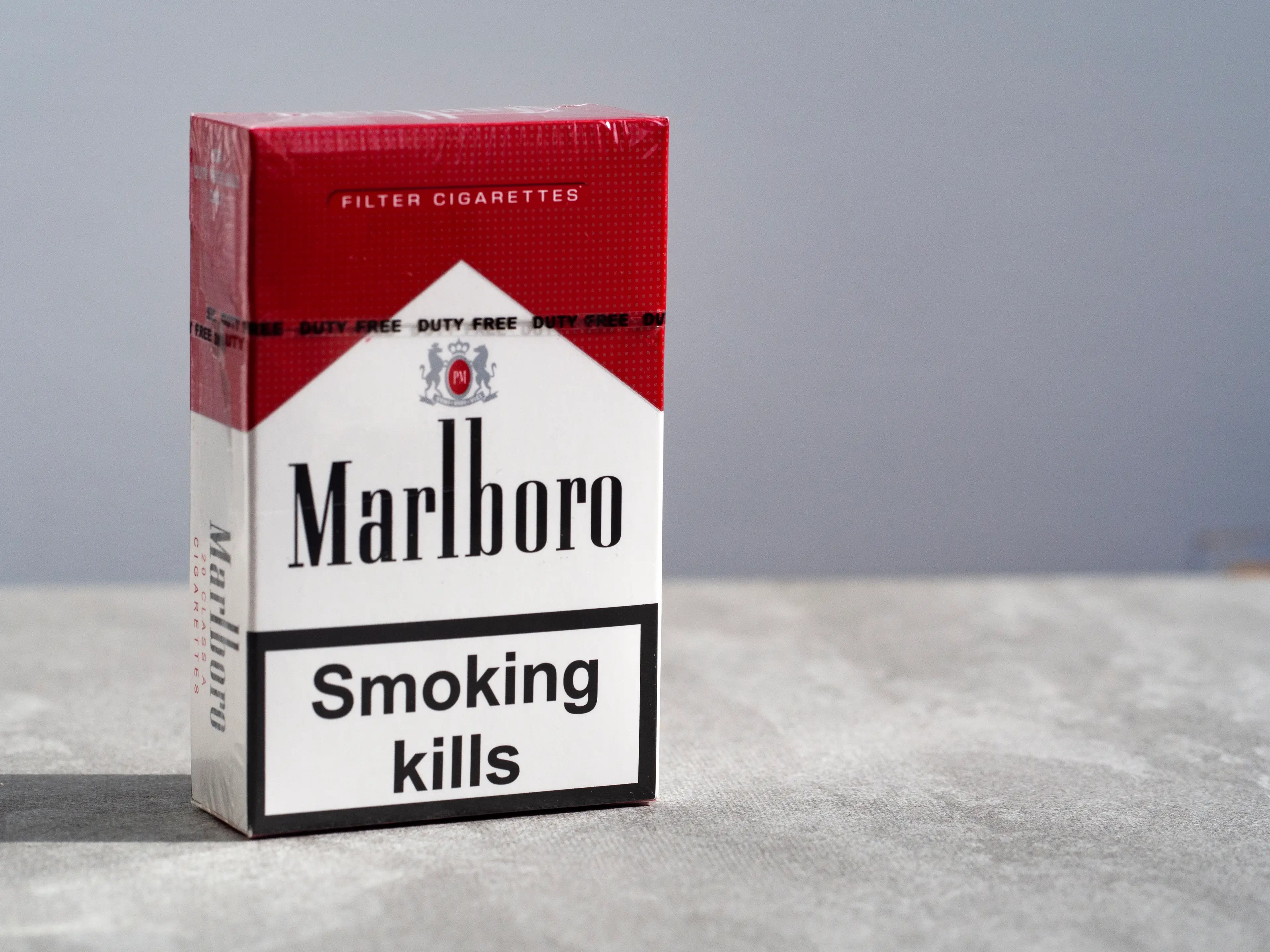
That comparison is Marlboro, with social media users repeatedly claiming Coca-Cola’s serif typeface looks similar to the cigarette brand’s lettering.
As noted by Creative Bloq, the font, called “Better With”, was created by Brody Associates in 2023 and was initially used during a holiday campaign. It is now being given a much bigger role across Coca-Cola’s marketing and packaging as part of the wider identity developed by design agency JKR.
Although it is not the same typeface used by Marlboro, the combination of the lettering and Coca-Cola’s red, white and black colours has led to the comparison spreading online.
One X user asked: “Why is the Coca-Cola rebrand in the Marlboro font?”
Another wrote: “This font treatment + the color immediately reminded me of Marlboro.
“They took the fridge cig meme literally.”
The comment refers to the existing online joke which describes Diet Coke as a ‘fridge cigarette’ or ‘fridge cig’.
A further user wrote: “When we joke about calling a crispy Diet Coke a fridge cig we didn’t mean rebrand coke to Marlboro jfc.”
Still, Coca-Cola has presented the refresh as a major step towards a single, recognisable identity around the world. Arnab Roy, president of Coca-Cola Global Category, said: “Coca-Cola is one of the most recognized brands in the world, and with that comes a responsibility to keep evolving.
“This refresh is about being clearer and more consistent in how we show up, wherever people experience our brand. By building on the things people already know and love, we're creating a stronger foundation for growth while staying unmistakably Coca-Cola.”
Rapha Abreu, global vice president of design at The Coca-Cola Company, added: “For over a century, Coca-Cola has been a global symbol of optimism and authenticity. Now, with one seamless visual identity, we can deliver one recognizable brand experience to consumers.”
Topics: Social Media, Drinks
 Ben Williams