Olive Garden has just changed its logo - it's not gone down well
Topics: Social Media, US Food, Restaurants and bars
 Ella Scott
Topics: Social Media, US Food, Restaurants and bars
Olive Garden fans have been told to ‘calm down’ after the American chain debuted a bold new look, swapping its classic emblem for a shiny new logo.
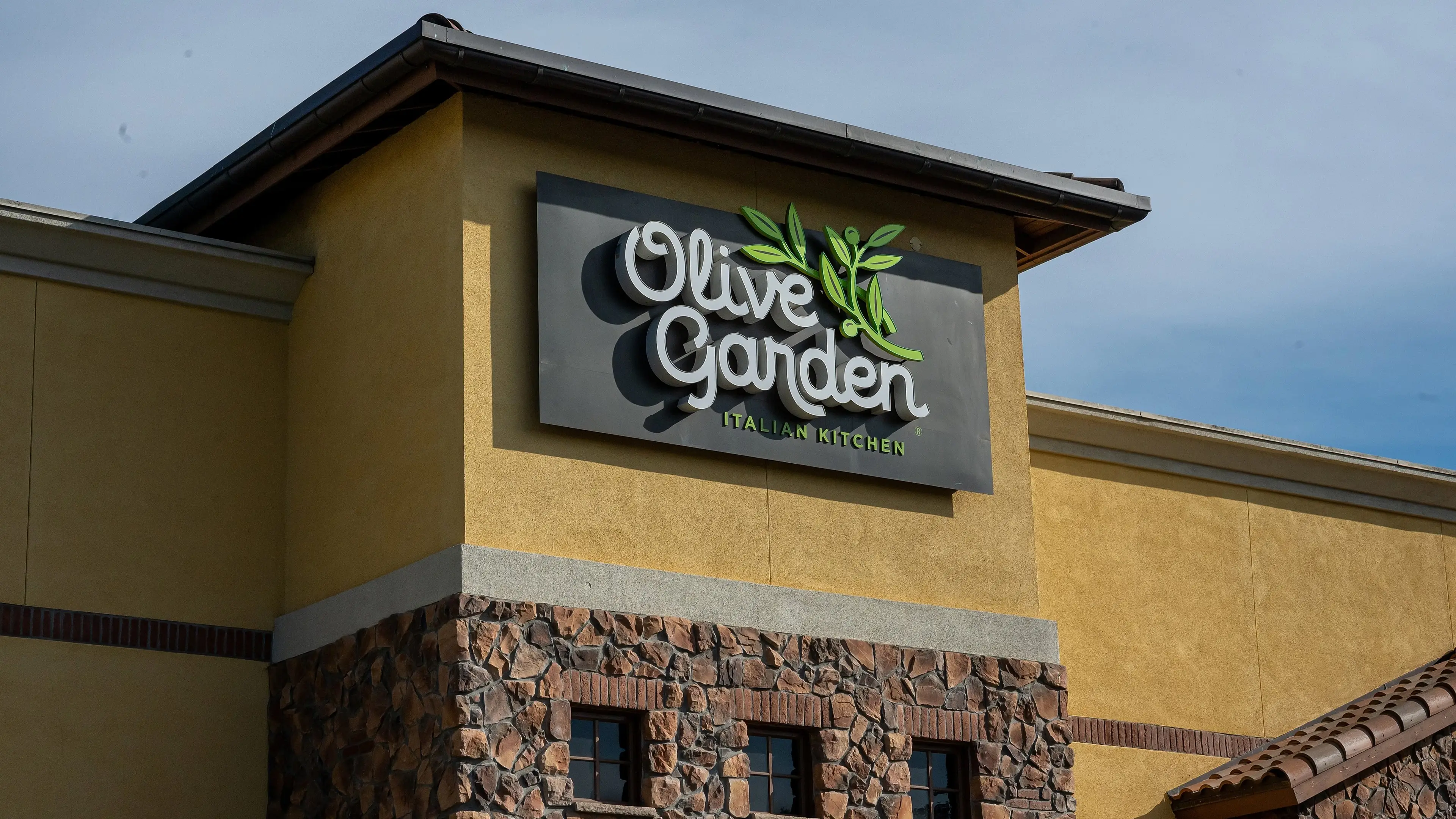
On 9 March, Olive Garden updated its Facebook logo for the first time since 25 January 2024.
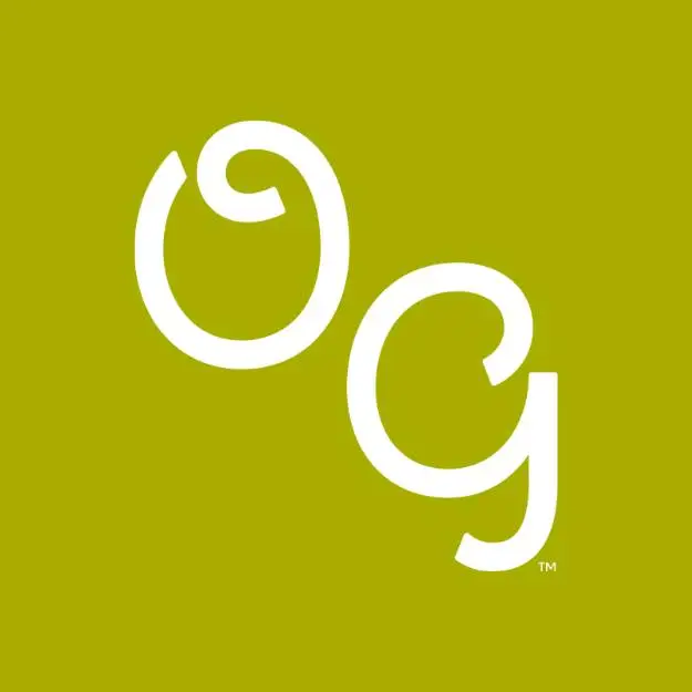
A slick olive green square with diagonal ‘OG’ initials was introduced without any comment, replacing the tri-colour ‘Olive Garden Italian Kitchen’ brand.
The minimalist design has been replicated across the restaurant chain’s other social media profiles, including Instagram, TikTok and X.
Advert
While Olive Garden hasn’t given a direct reason for its logo revamp, it did write that it was ‘iconic’ in the Facebook comments.
The quip was seemingly shared in response to a critic who wrote in all captials: “Oh no they went bland.”
Others fans have had their say, with one typing: “Garden Of Olives, what is going on?”
A third demanded: “Change it back.”
“Another Oversimplified logo,” remarked someone esle.
One Facebook user has defended the identity switch-up, telling other Olive Garden eaters to ‘calm down’.
“Guys guys calm down… they are rebranding to Original Gangster,” they joked.
Many have admitted that they’ve been referring to the brand as ‘OG’ for ‘years’, with one penning: “That’s what I call it! Babe, let’s go to OG!!”
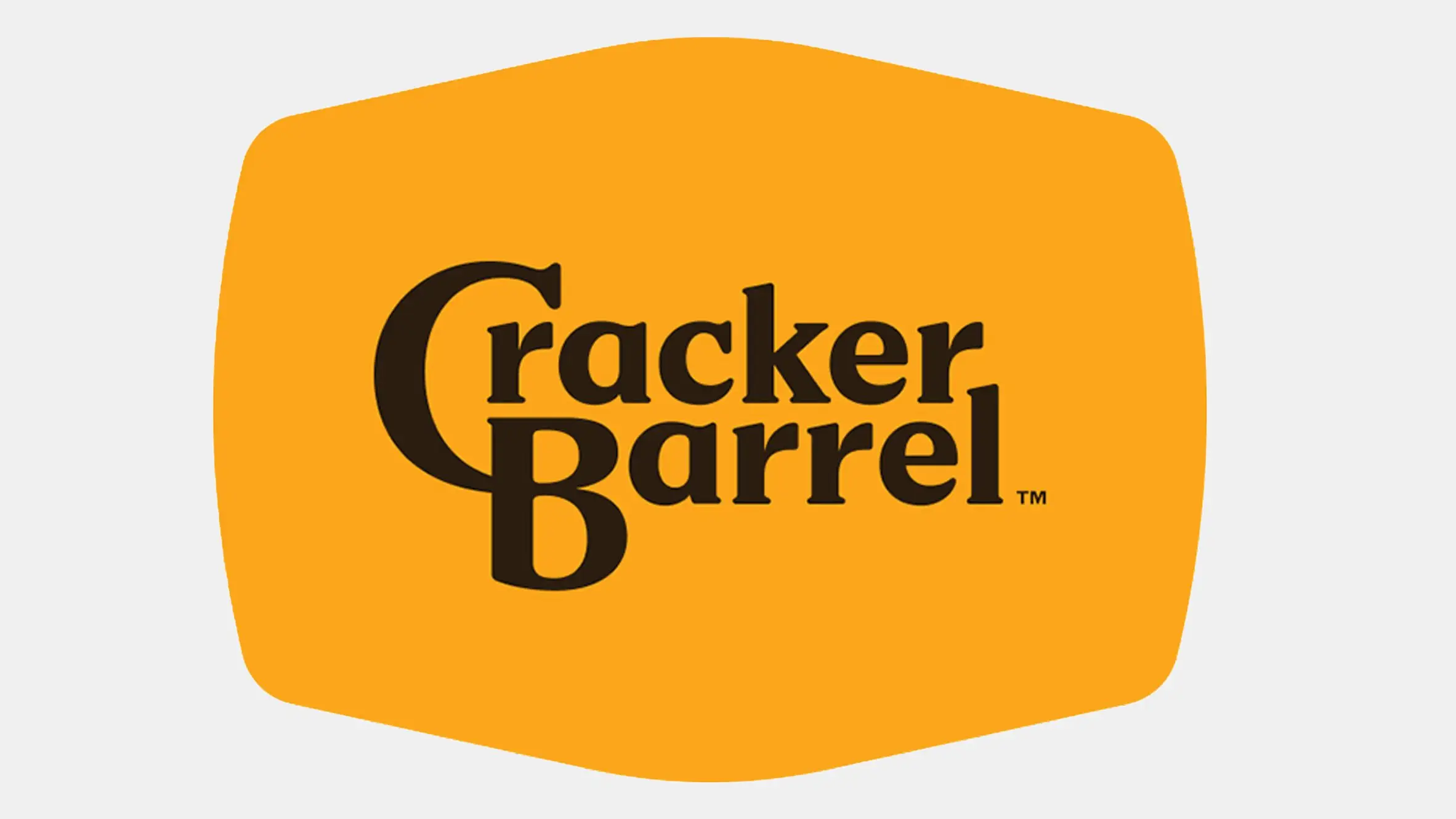
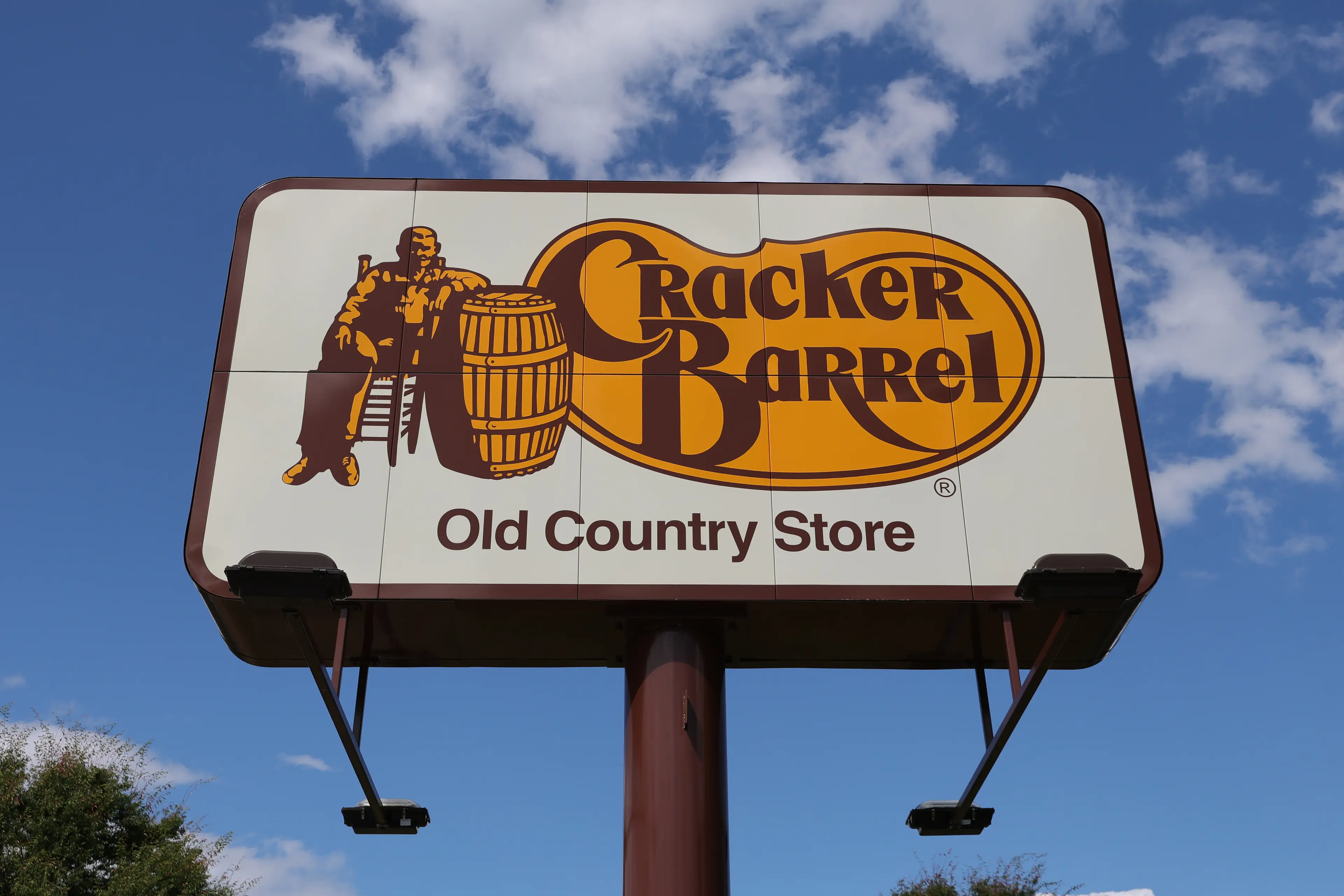
“Cracker Barrel gonna be mad if this works,” an additional user stated, referring to the recent backlash that the Southern-themed chain received after attempting to change its logo.
Last August, Cracker Barrel made a pivot in its signage, replacing its logo, which features a man named Uncle Herschel leaning on a barrel beside the words ‘Cracker Barrel’.
The US favourite redesigned its signature in line with its All the More’ campaign, focused on aesthetic shifts and redesigns at its restaurants.
In a statement to FOODbible, a spokesperson for the business said: “Our values haven't changed, and the heart and soul of Cracker Barrel haven’t changed.
“And Uncle Herschel remains front and center in our restaurants and on our menu. He is the face of ‘The Herschel Way’ the foundation of how our 70,000 plus employees provide the country hospitality for which we are known.
“Cracker Barrel has been a destination for comfort and community for more than half a century, and this fifth evolution of the brand’s logo, which works across digital platforms as well as billboards and roadside signs, is a call-back to the original and rooted even more in the iconic barrel shape and word mark that started it all back in 1969.”
However, when the simpler, text-only setup was debuted, fans had a lot to say.
“Dear Julie at @CrackerBarrel, the feedback is NOT GOOD!” said one X user, referring to CEO Julie Felss Masino. “The new logo lacks a cracker and barrel—an epic fail. This mistake will cost you millions. Who’s the genius that approved this? Dear Lord, leave it alone FFS.”
Another called it the ‘ugliest logo’ they had ever seen while Donald Trump Jr. said: “WTF is wrong with Cracker Barrel??! She [Masino] scrapped a beloved American aesthetic and replaced it with sterile, soulless branding.
Following the criticism, Cracker Barrel elected to bring back its ‘Old Timer’ logo.
"At Cracker Barrel, it's always been – and always will be – about serving up delicious food, warm welcomes, and the kind of country hospitality that feels like family,” the company wrote via X.
“As a proud American institution, our 70,000 hardworking employees look forward to welcoming you to our table soon.”
President Donald Trump took to his social media site, Truth Social, to comment on Cracker Barrel staff ‘changing the logo back’.
“All of your fans very much appreciate it,” the typed.