People confused after popular seafood restaurant replaces animal in logo
Topics: Restaurants and bars, US Food
 Niamh Spence
Topics: Restaurants and bars, US Food
Most restaurants have logos that make it pretty clear what they're selling or what they're about - surely that's the aim of the game.
Burger King's simple burger design sums them up nicely, while Taco Bell might not be a taco but it does have a bell so still feels suitable.
For one US restaurant chain their logo was crystal clear for years, but now it's changed.
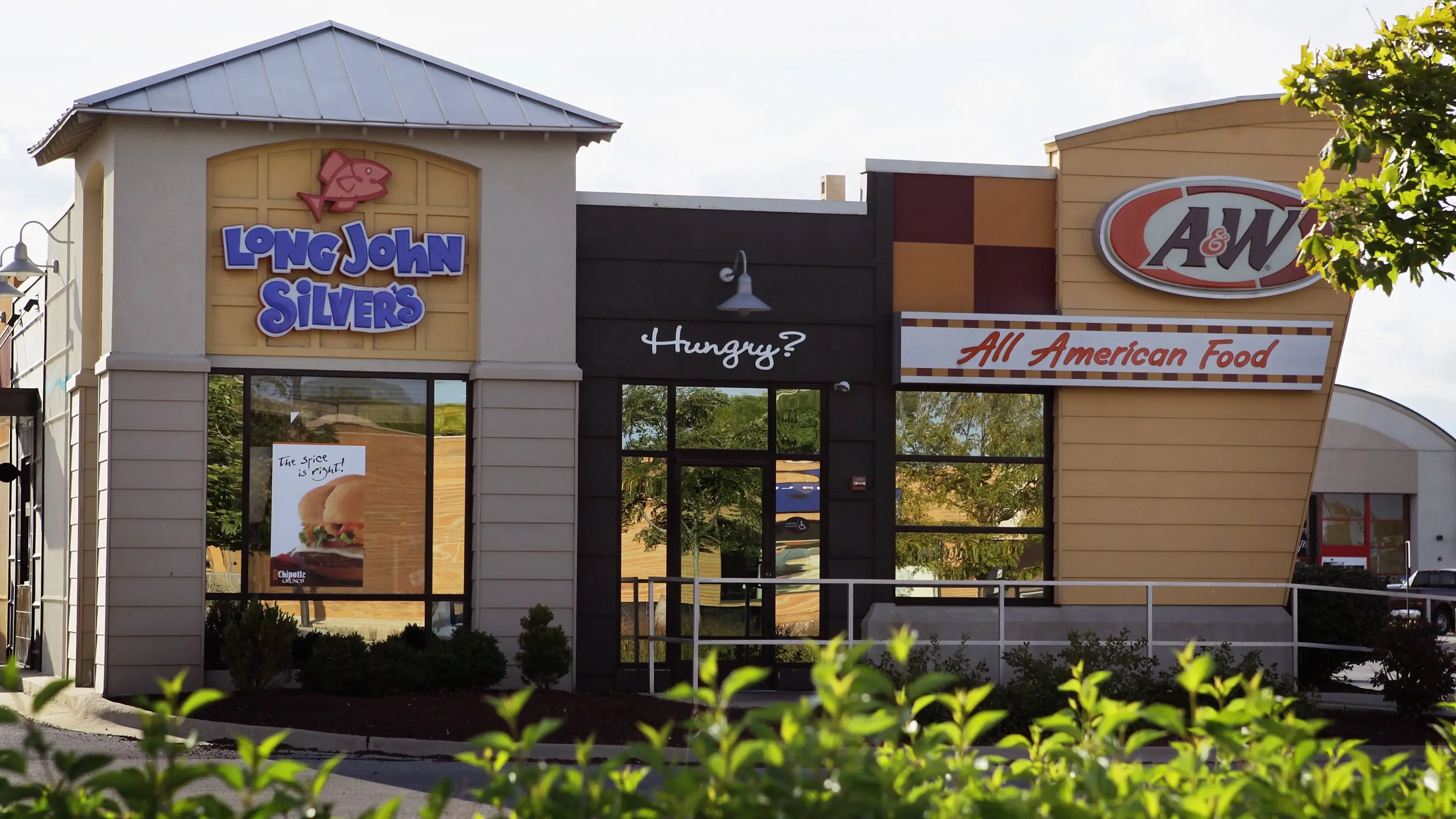
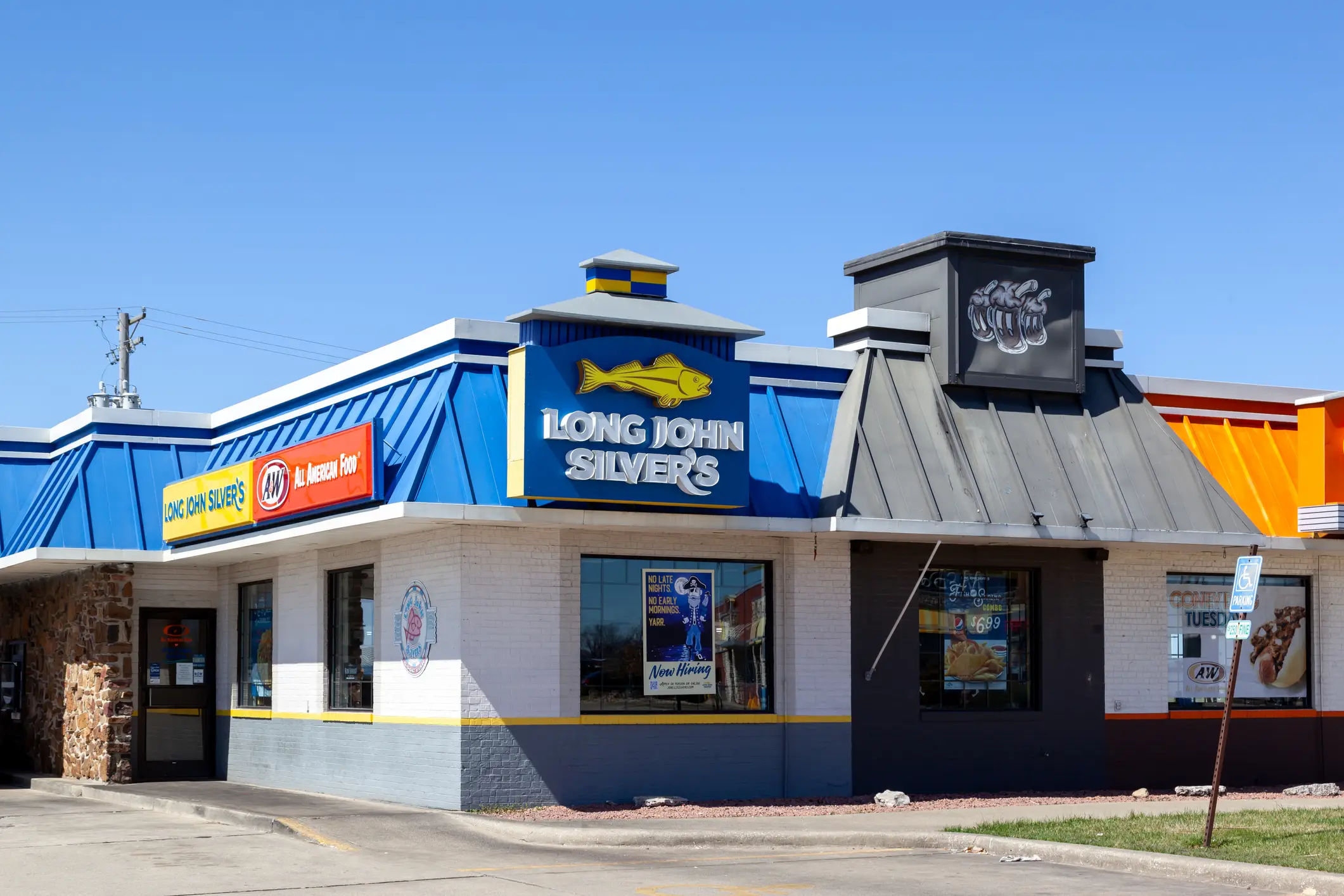
US eatery Long John Silver's - its name referencing Treasure Island and life at sea - understandably had a fish in its logo for many years, as seafood is what it's known for.
Advert
Now the menu has expanded somewhat and there are more dishes available than just fish and seafood, so the restaurant has been undergoing changes over the past year with its logo being one of them.
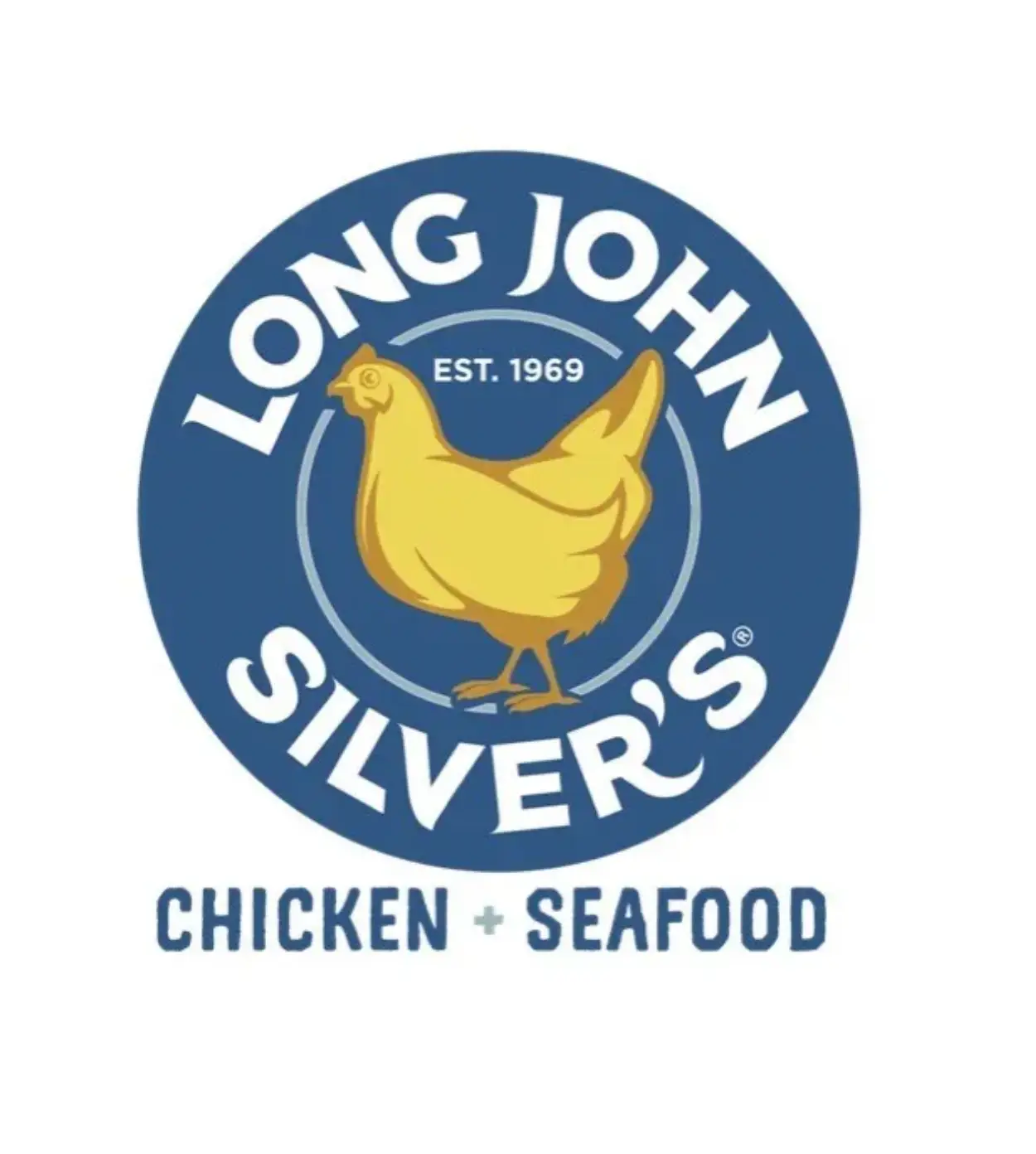
The logo used to feature a huge golden fish in the middle of the emblem, yet now it features a chicken as a nod to some of the non-seafood dishes it offers. The Louisville, Kentucky, based company also added the phrase 'Chicken + Seafood' to the new logo, just in case it wasn't clear.
Fish has been in the centre of the company’s logo since 2001, with its previous design change taking place in 2016, so losing it has been a big change.
Yep, that means it's a seafood restaurant with a pirate inspired name, but the logo is a chicken... you can understand why many people are not following.
The restaurant was typically known best for its fried fish platters but with the newer menu it now also offers chicken strips, which it argues are it’s 'best-kept secret'.
The new changes to its logo and appearance 'will strategically roll out the branding across other properties and materials', according to a press release from the brand.
In the release, Christopher Caudill, Long John Silver’s senior vice president of marketing and innovation, added: "Guests have been telling us for years that our chicken is a best-kept secret.
"Our hand-battered chicken strips — known as Chicken Planks — are every bit as crave-worthy as our legendary fish. It’s time we let that secret out."
However, the new look is causing some confusion for customers, as one took to X to say they were 'not sure what to make of this'.
"Anyway Long John Silver's is putting a chicken on its logo to highlight its chicken offerings," they said.
"Not sure if this is a permanent change or just some marketing gimmick. But it's tough to be a seafood chain so you get things like this."
Another added: "This is an absolute outrage. Their chicken is actually pretty decent, but I am appalled they would be de-emphasizing their seafood."
"I do love the chicken at Long John Silver’s but given the name of the restaurant and what they’re primarily known for this is incredibly stupid," shared another person on Facebook.
Another added: "That’s so bizarre!"