People fuming after Cracker Barrel unveils 'epic fail' new logo
It’s nigh-impossible for a company to go through a rebrand, rejig its logo, or alter its messaging without frothing bile following in its wake.
The most innocuous change is likely to get labelled as ‘woke’ by anyone with a passing interest in riling people up, and that much has been true for Cracker Barrel’s recent design pivot.
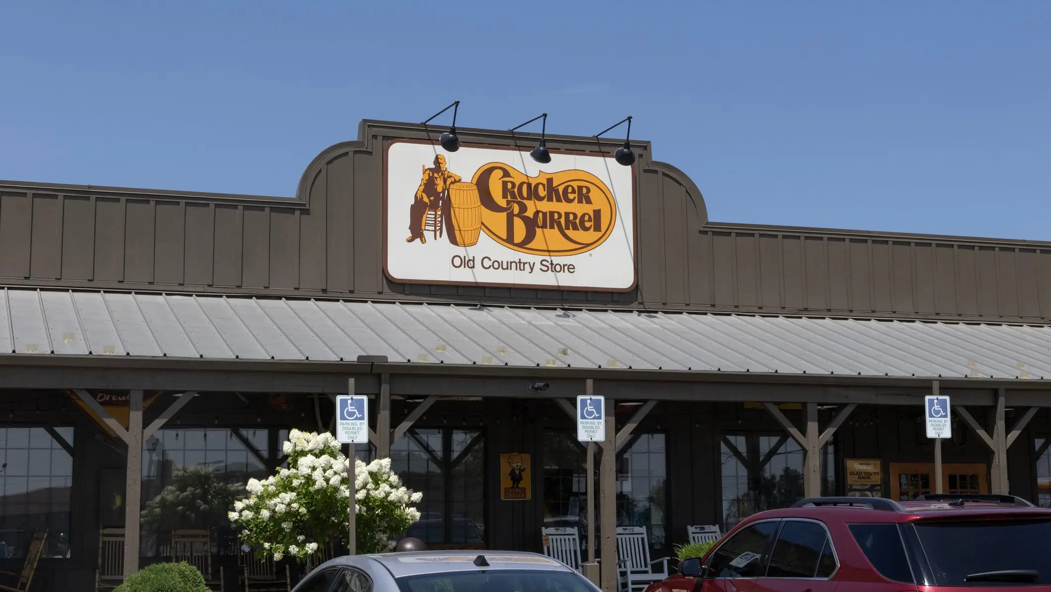
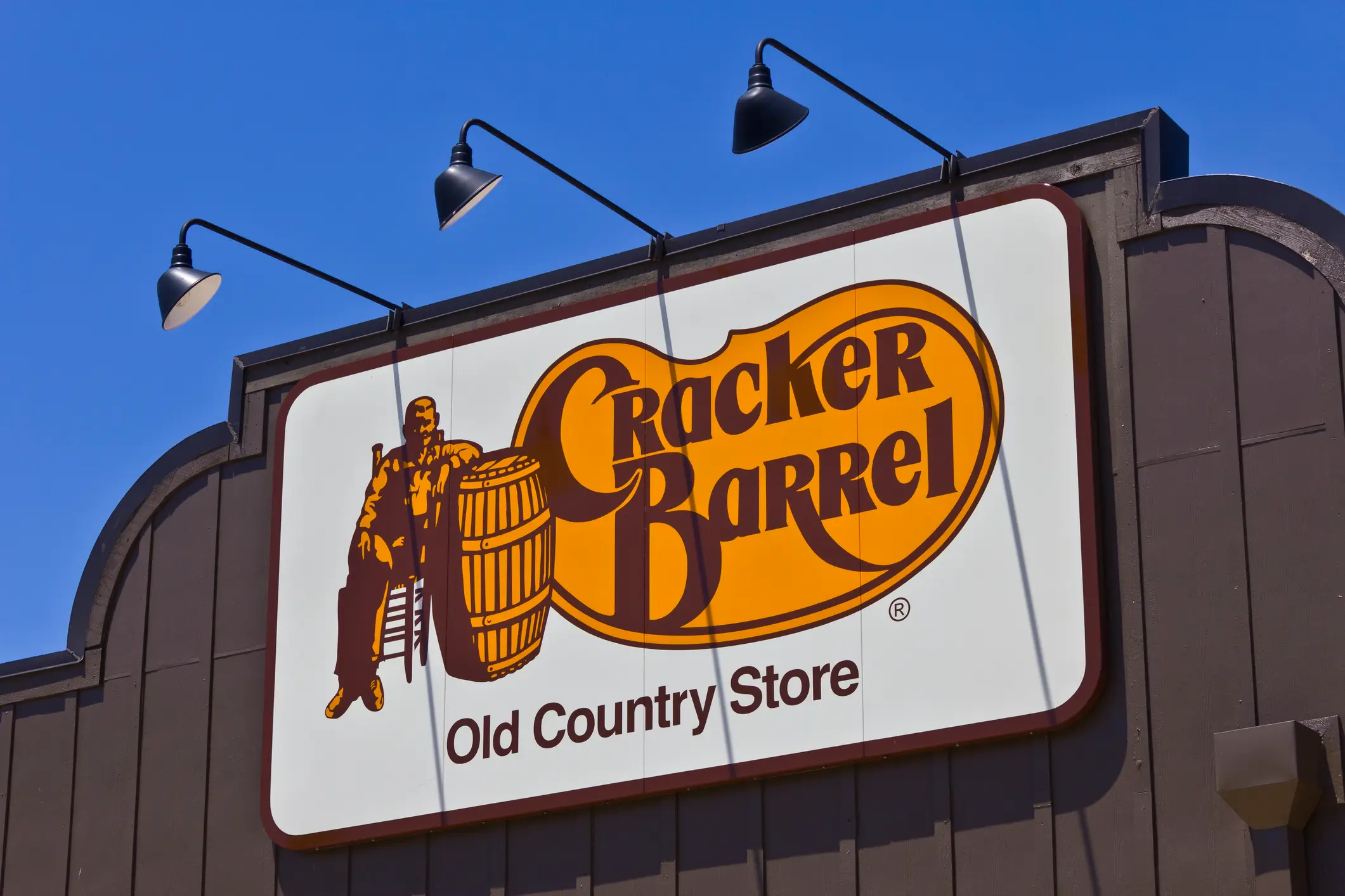
For those unfamiliar, Cracker Barrel is a popular Southern-themed restaurant chain that, until recently, has had a logo featuring a man leaning on a barrel beside the words ‘Cracker Barrel’.
Along with its restaurant, the chain operates Southern-themed gift shops tapping into nostalgia for the US’s growth and industrialisation through the 1800s and first half of the 1900s.
Advert
Its name and original logo was inspired by soda cracker barrels that were common to small towns in the American South in the early 1900s. Some have taken the ‘cracker’ element to mean something else, namely the pejorative nickname referring to white ‘whip crackers’ during the American slave trade, but this was never the brand’s official intention.
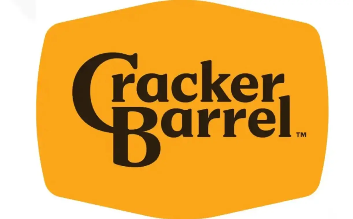
Now that the logo has been redesigned with a simpler, text-only setup, some commentators believe it’s a move from the company to ‘go woke’ and erase some of its Southern roots.
The new logo has a subtle barrel-shaped background along with a light retouching to the brand name’s font.
It comes as part of a wider move for the company to simplify its setup, with an ‘All the More’ campaign focused on aesthetic shifts and redesigns at its restaurants. The interiors are being decluttered and given a lighting boost, changing the ambience of the old-time restaurant for a modern look.
A new menu will also launch later in 2025 to help give the old place a new lick of paint.
The new menu will feature plenty of old favourites, along with returning classics like the Uncle Herschel’s Favorite breakfast plate which features two eggs and a choice of ham, catfish, chicken tenders, or strip steak. On the side you’ve got a choice of a hash brown casserole or fried apples, buttermilk biscuits, grits and gravy.
These changes come in the wake of a sales decline, although it seems that fans of the brand are less than happy with the changes.
“Dear Julie at @CrackerBarrel, the feedback is NOT GOOD!” said one X user, referring to CEO Julie Felss Masino. “The new logo lacks a cracker and barrel—an epic fail. This mistake will cost you millions. Who’s the genius that approved this? Dear Lord, leave it alone FFS.”
Another X user chimed: “What is Cracker Barrel thinking? This is the ugliest logo I've ever seen. Nothing iconic. Too much empty space. I didn't even realize it was barrel shaped until I read it was.”
“Cracker Barrel released a new boring, soulless corporate logo,” added yet another.
The opprobrium has even reached the White House, with Donald Trump Jr saying: “WTF is wrong with Cracker Barrel??! She [Masino] scrapped a beloved American aesthetic and replaced it with sterile, soulless branding.”
Cracker Barrel said in a statement to FOODBible: ''Our values haven't changed, and the heart and soul of Cracker Barrel haven’t changed. And Uncle Herschel remains front and center in our restaurants and on our menu. He is the face of "The Herschel Way”, the foundation of how our 70,000 plus employees provide the country hospitality for which we are known. Cracker Barrel has been a destination for comfort and community for more than half a century, and this fifth evolution of the brand’s logo, which works across digital platforms as well as billboards and roadside signs, is a call-back to the original and rooted even more in the iconic barrel shape and word mark that started it all back in 1969.''
Any excuse for a good froth.
Topics: Restaurants and bars, US Food
 Rachael Davis