New Walkers logo could have hidden meaning, according to marketing professor
Topics: UK Food
 Ella Scott
Topics: UK Food
Walkers has debuted its updated logo - the 'biggest change' in almost eight decades - and a marketing expert has weighed in on what the update may mean for snack fiends.
The British cupboard staple is seemingly entering a new era, with a new flavour, and an exciting promotion on the cards.
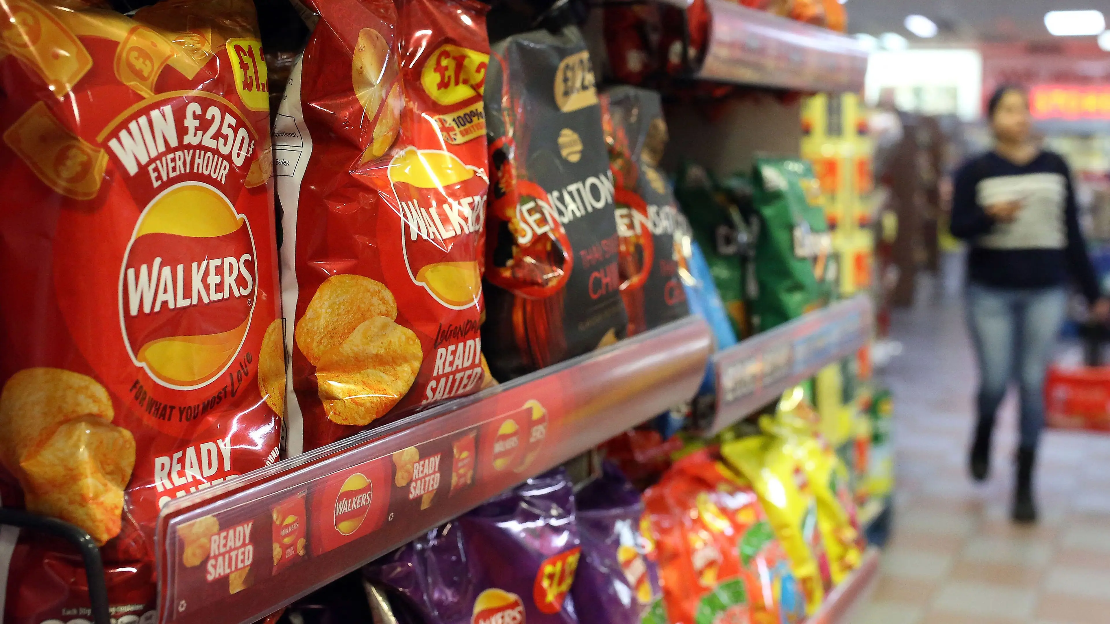
From 26 January, shoppers will hunt through packets of Walkers ready salted, cheese and onion, and selected variety packets, in the hopes of discovering a 'golden potato' ticket.
There’s a whopping £10,000 up for grabs and over 500,000 prizes to be won. Stumbling upon a gold pack of crisps instantly secures the prize.
Advert
“Our Golden Potato promotion also gives retailers an unmissable opportunity to drive excitement and keep Walkers front of mind for shoppers,” said Wayne Newton, marketing director at Walkers.
“It’s a significant step forward for Walkers and the start of an incredibly exciting year for the brand.”
But that’s not all the legacy snack brand is cooking up in 2026.
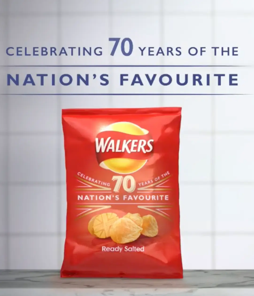
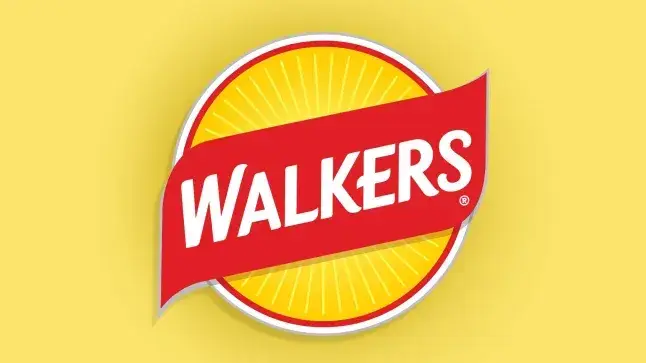
For the first time in almost 80 years, Walkers crisps has boldly updated its logo to a new ‘sun-inspired’ design.
Newton called the revamp a ‘landmark moment’ for the brand.
“For the first time in many years, we are bringing a completely new visual identity to the brand – one that champions our heritage, elevates the message around the use of our quality ingredients, and injects new energy into the category,” he claimed.
It is set to be supported by a wider 360 multimedia campaign from mid-February, according to Grocery Trader.
Zachary Estes, a professor of marketing at Bayes Business School, believes that there could also be a ‘hidden meaning’ behind the logo.
He began by telling Metro there are usually only two reasons that parent company PepsiCo would choose to change it.
The first is to update the brand. The second is to signal to customers that the company is set to make serious changes.
“Merely adding a new flavour obviously does not merit a whole new brand logo, which makes me think Walkers may have something bigger coming soon,” he told the outlet.
“The iconic yellow crisp at the centre of the old logo told consumers exactly what is inside, which is important when consumers don’t know the brand. "However, when they do, it can be constraining. The old logo signals that Walkers only sells crisps."
Estes called the new sun-like logo an ‘odd change’ to make, unless the business is thinking about branching out.
And it turns out the marketing professor may have hit the jackpot.
In a statement, Newton confirmed it was the ‘start of an incredibly exciting year for Walkers’.
“Watch this space,” he added to the outlet.
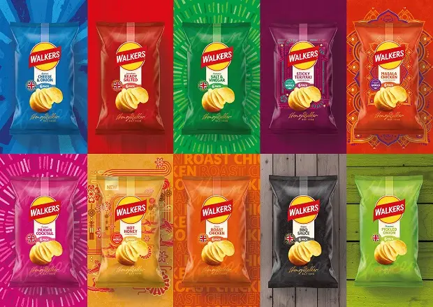
The Walkers rebrand comes amid a wide grocery roll out of the business’ latest sensation: Hot Honey flavour.
Available in stores now, the new variant joins the growing Flavours of the World portfolio.
It follows in the footsteps of Sticky Teriyaki and Masala Chicken, which were released across the United Kingdom last year.
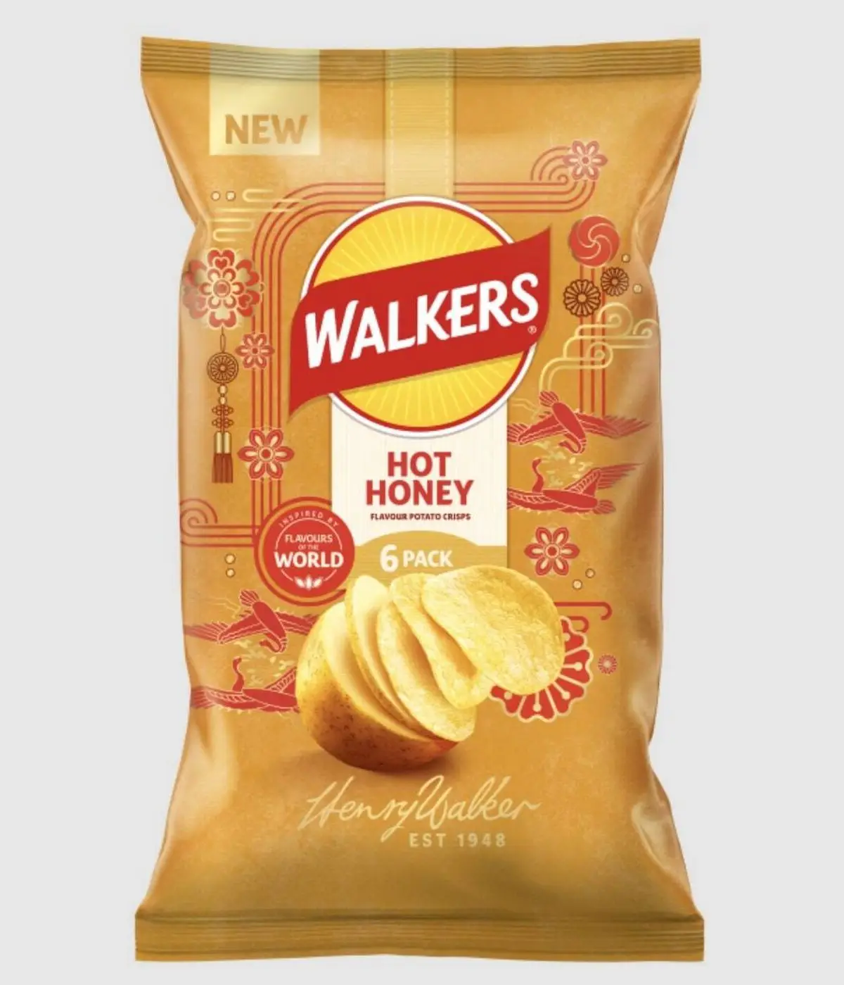
Surprisingly, the Hot Honey flavour - available in a six-pack for £2.15 - is dividing the internet, with one X user writing: “Everybody’s doing hot honey rn!”
A second remarked: “I volunteer to taste test them!!”
“Walkers hot honey crisps,” someone else wrote, followed by a meme image which reads: ‘I wish the lord would take me now’.
Walkers isn’t the only brand to jump on the hot honey craze, with McVitie’s, Kellogg’s, and even M&S bringing out products in the past year.