Cadbury makes major change to Roses but fans are divided
 Ben Williams
Cadbury has made a noticeable change to one of its most iconic chocolate boxes, and it’s fair to say the update hasn’t gone unnoticed by fans.
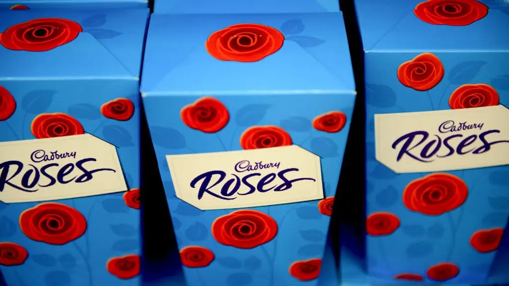
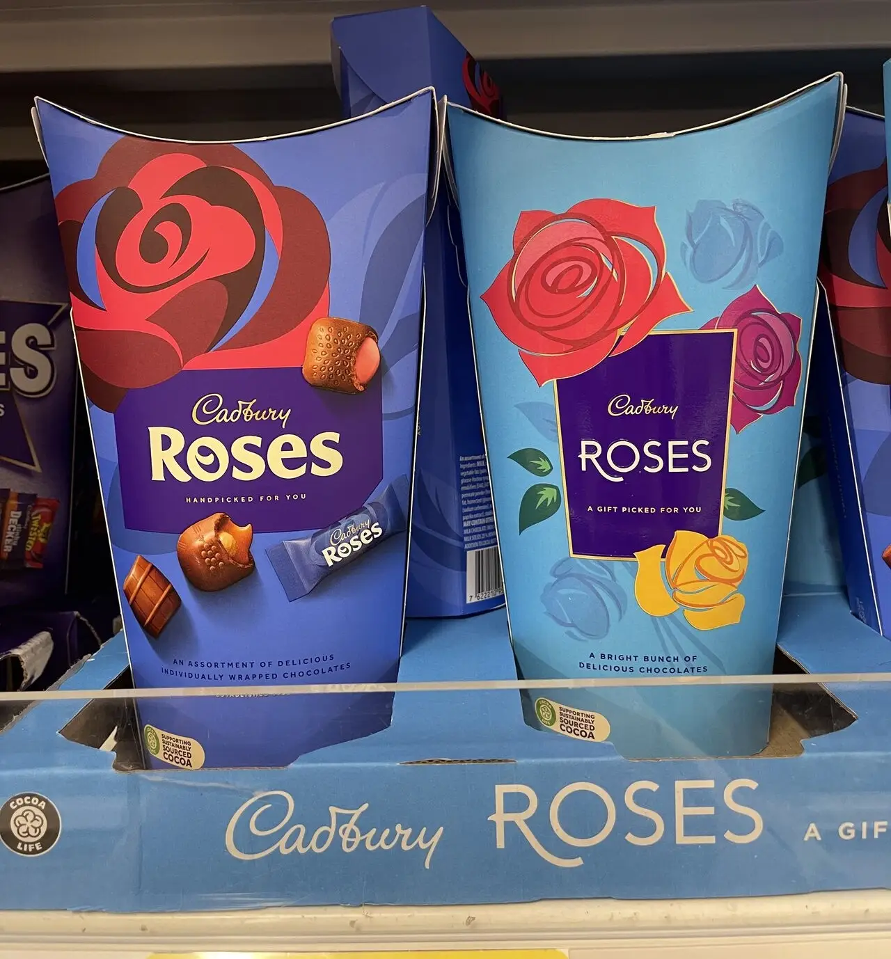
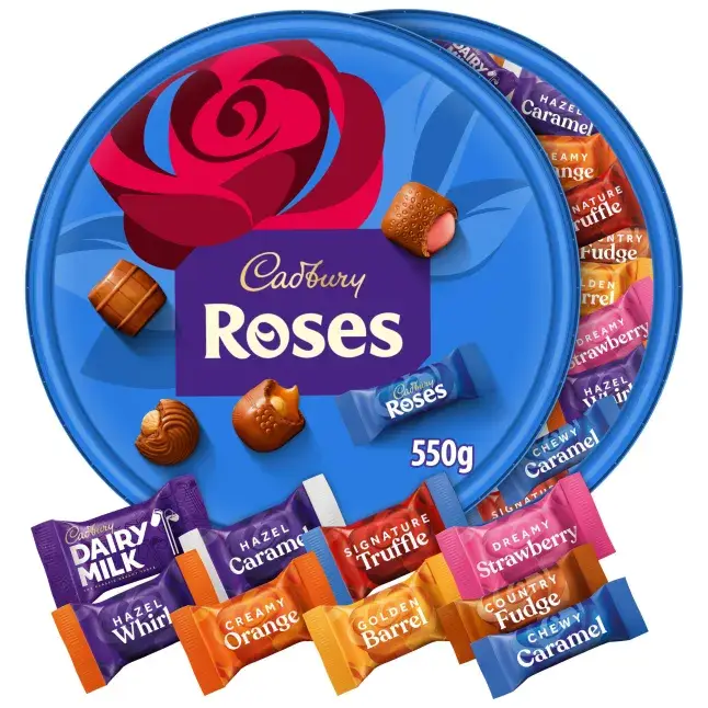
If you’ve picked up a tub of Roses recently for Christmas, you may have already spotted that things look a little different this year. That’s because the confectionery giant has quietly rolled out a refreshed look for the much-loved assortment, updating both the outer packaging and the individual sweet wrappers.
The most obvious change is the colour. The classic bright blue tub has been swapped for a darker shade, edging closer to Cadbury’s signature purple. Alongside that, the wrappers inside now clearly spell out what flavour you’re grabbing, with large text boldly stating what’s inside each sweet.
Advert
Cadbury has confirmed the refresh is part of a wider effort to modernise the brand while still keeping it recognisable.
A spokesperson for Mondelez International, which owns Cadbury, said: "Launched in 1938, Roses is a much-loved Cadbury heritage brand, and has been a fan-favourite for gifting and showing appreciation to loved ones for over 85 years.
"This year, we have refreshed our packaging to make our products feel even more gift-worthy, highlighting the beauty of our heritage Rose symbol while evolving to keep up with changing consumer tastes."
The changes are being rolled out for the chocolate boxes nationwide, meaning shoppers across the UK can expect to see the updated tubs, tins, and boxes on shelves.
However, while some have welcomed the new look, others aren’t convinced.
The updated appearance was unveiled via a LinkedIn post by Because of Marketing, and the professional social media platform has been buzzing with debate, with opinions split on whether the refreshed design has lost some of its charm.
In response, one person said: “I don’t see as much of a story or idea here, on the new design. Previous design is clearly a bouquet and feels more giftworthy for that. Where are we in the universe with the new one? Not sure… Whilst its aesthetic is up to date, I feel it’s a little lacking in charm.”
Another user echoed similar sentiments, writing: “I don’t see design advancement? Where’s the warmth, the big bouquet, the gift for mum, the warm fuzziness this brand ‘used’ to portray when I was a youngster? This feels cold!”
Someone else kept it short and not so sweet, with: “A painful goodbye to my childhood.”
That said, plenty of people are firmly on Team New Roses. Amerjeet Sira commented: ‘“I love the updated packaging design! The changes are not too drastic, which keeps the brand recognisable, but the subtle updates such as the bolder rose illustration and refined font really stand out. The product shot on the packaging is a great touch too! Definitely a win!”
Lumina Studio Marketing also praised the refresh, saying: “The new Cadbury Roses design is clean, bold, and still feels familiar. A perfect example of how to refresh a brand without losing its soul. Sometimes less really is more.”