Surprising reason why rarest McDonald's in the world has blue arches
 Rachael Davis
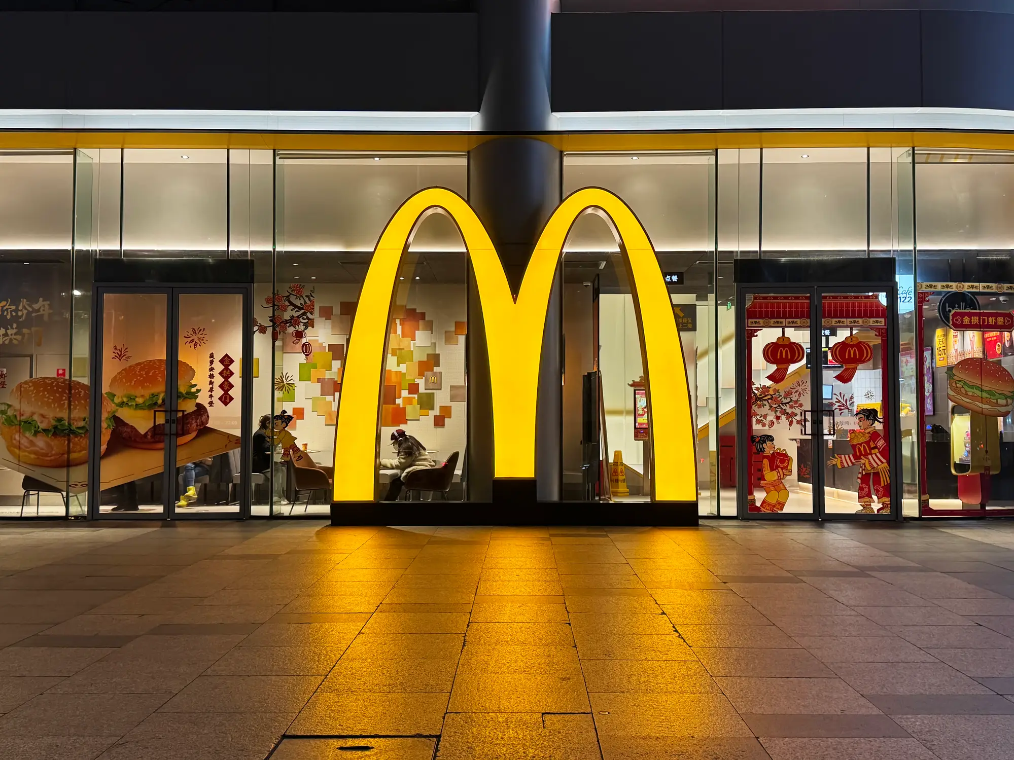
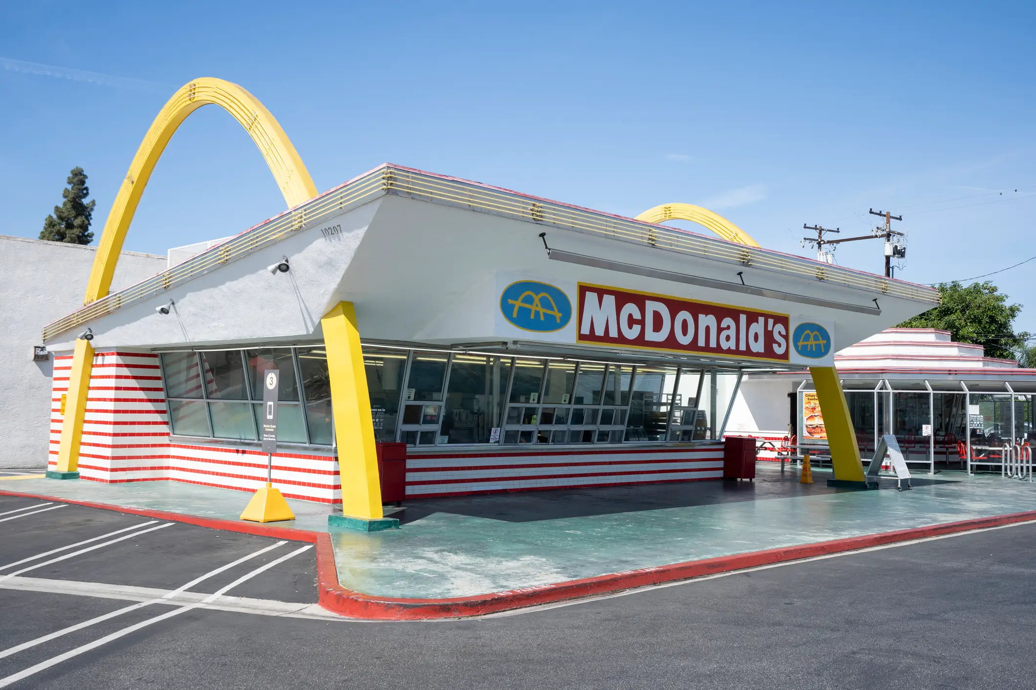
If there’s one thing more synonymous with McDonald’s than a Big Mac, a McNugget, or a red-and-white-striped clown, it’s the golden arches.
Those golden arches, themselves representing the M of McDonald’s, is one of the most iconic logos. Recognised the world over, they’re a universal of symbol of nearby burgers.
Big brands aren’t always shy about fiddling with their logos, of course. Did you notice the rotated Nike ticks featured on some of Chelsea, Liverpool and Tottenham’s football kits this season?
Advert
That limited change was made to reference the surge in interest in and coverage of women’s football in recent years, and it seems as though it’s business as usual logo-wise besides those examples.
Rotating the McDonald’s arches wouldn’t make a lick of sense considering they’re supposed to be an M, but the brand isn’t beyond tinkering with its logo to fit local sensibilities.
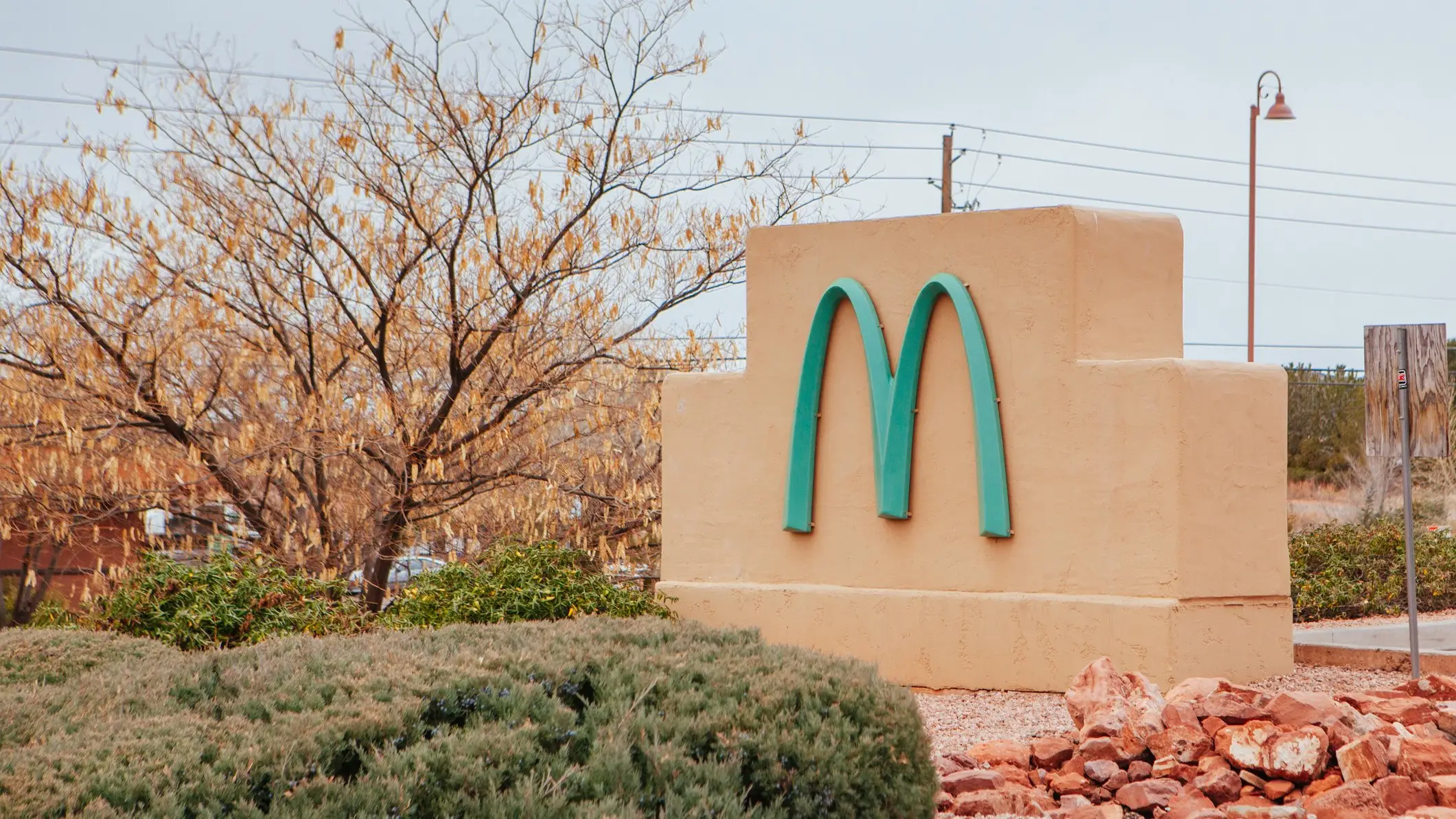
That was certainly the case with its outlet in Sedona, Arizona, which features a teal blue M logo instead of the classic yellow.
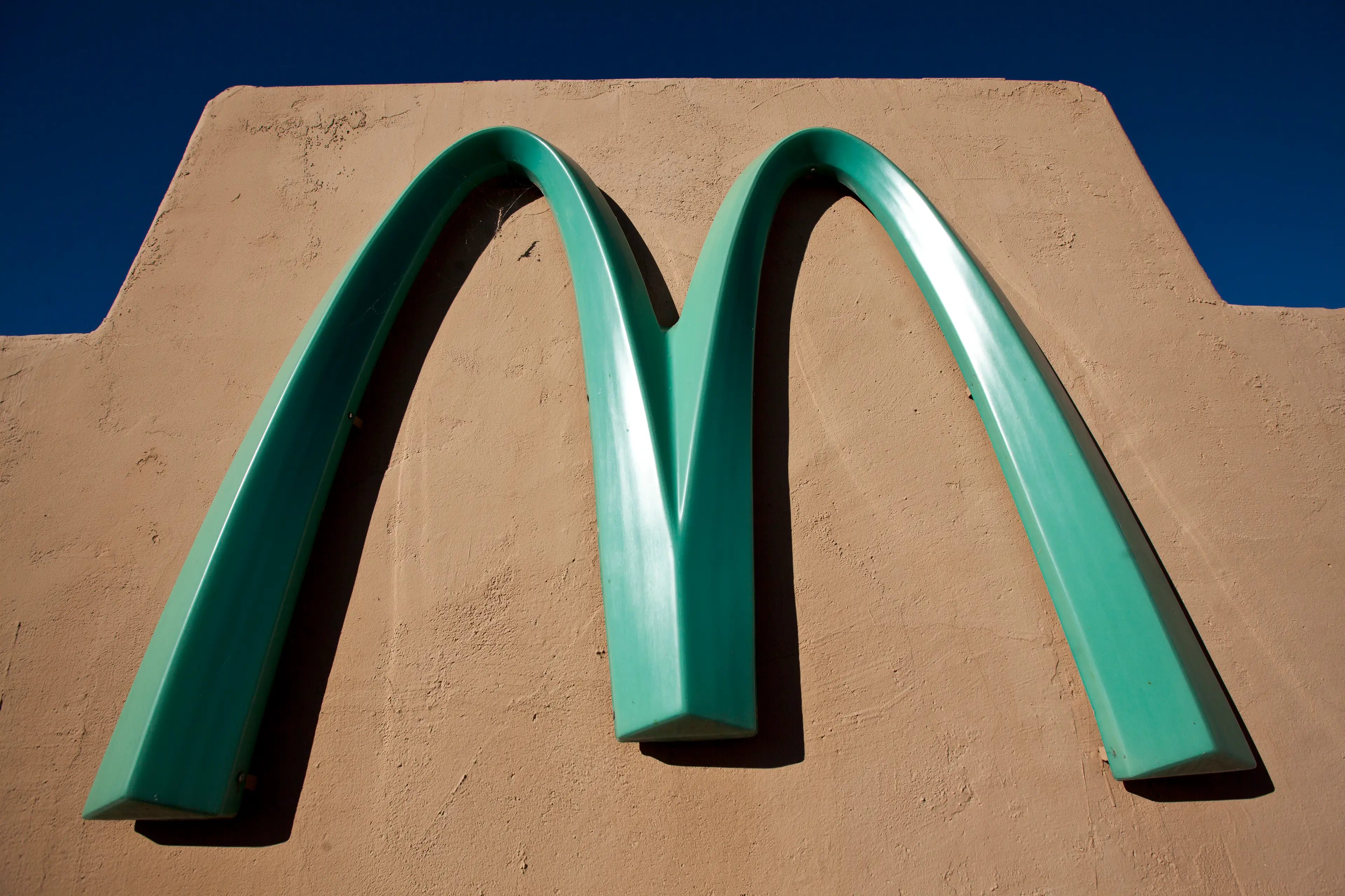
Across 41,000 restaurants worldwide, this Arizona franchise is the only one to feature blue arches. The reason behind it isn’t particularly exciting, but it has given the place a unique spin that locals likely appreciate.
Having opened in 1993, it was originally planned to have typical golden arches. This didn’t sit well with the Department of Community Development and members of the local community.
Sedona is known for its red rock mountains, often clear blue skies, and general sense of natural and architectural beauty.
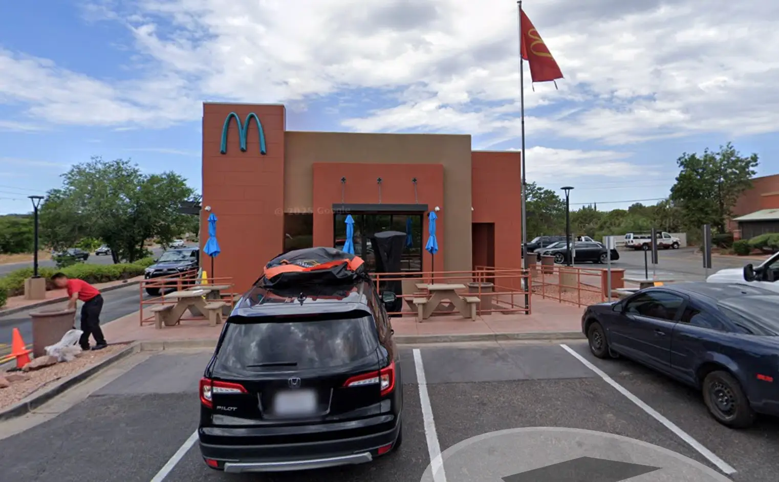
It was felt that the yellow arches wouldn’t fit well with the local environment, so teal was picked instead so the logo would blend-in more effectively.
"Someone suggested it would be interesting if they did something else than golden arches to fit in with the identity that the city decided to establish," explained Cari Meyer, senior planner at the local Department of Community Development, in a 2022 with ABC 15.
While it’s the only McDonald’s franchise to feature blue arches, it’s not the only one to forgo the traditional yellow.
Two franchises – one in Paris, France and another in Bruges, Belgium – have white arches. Another in Rocklin, California, has red arches, while another Californian branch has black ones.
Some don’t have two arches at all, instead retaining the single one from McDonald’s original logo. At least seven McDonald’s outlets in the US have got a single-arch logo, including one a piece in New Jersey, Florida, Colorado, and Arkansas.