History behind original Lyle’s Golden Syrup logo revealed as it gets a modern redesign
Topics: UK Food, Social Media
 Rachael Davis
Topics: UK Food, Social Media
Unless you’re a serial baker with a sweet tooth, you probably don’t spend too much time looking at tins of golden syrup.
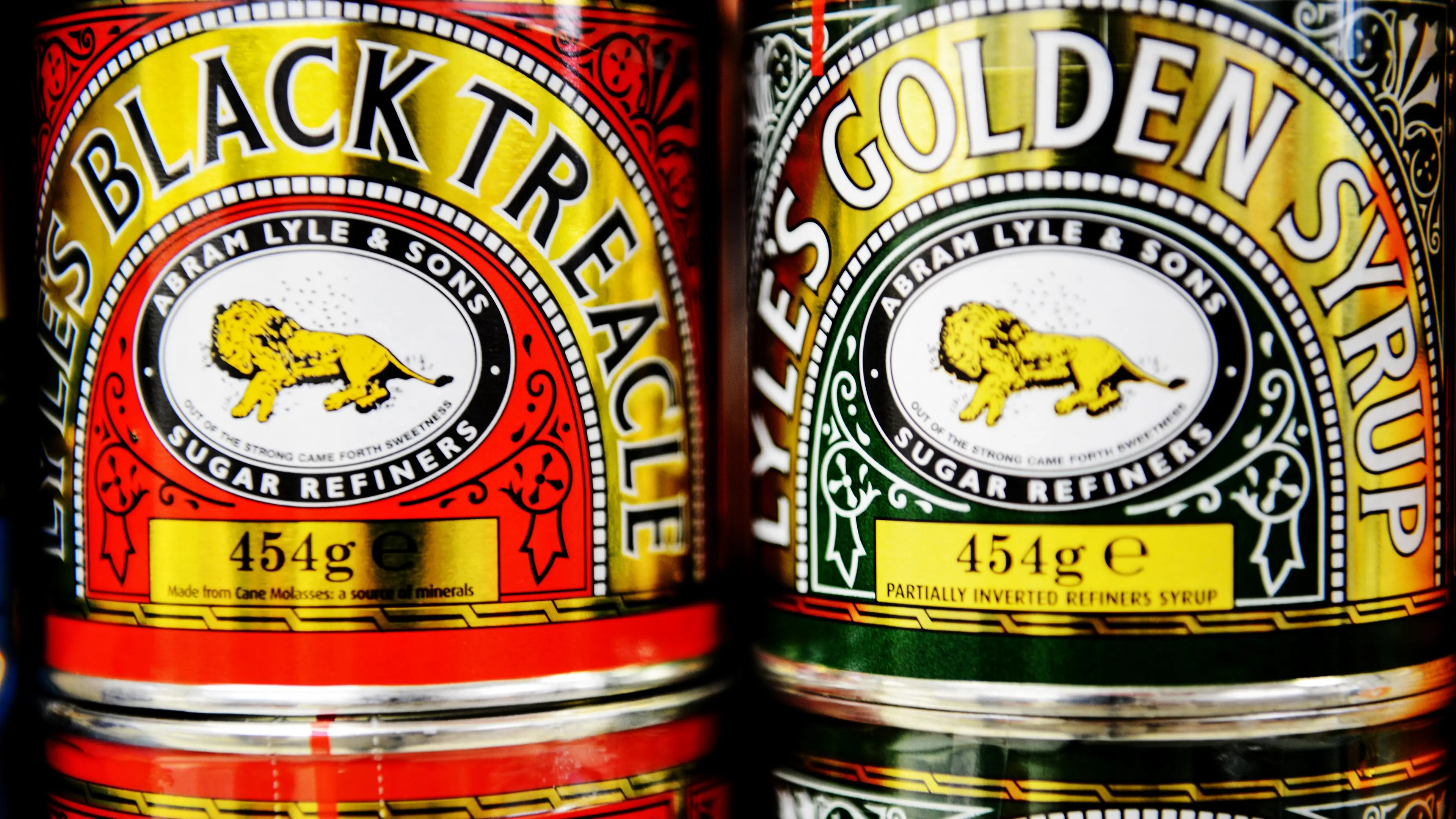
But if you do, the odds are that it’s Lyle’s Golden Syrup. For over a century the green tins featured a particularly unusual logo: a lion carcass surrounded by a swarm of bees.
‘Out of the strong came forth sweetness’, reads the tagline.
This logo first appeared on Lyle’s Golden Syrup tins in 1883, and it holds the Guinness World Record for having the world’s oldest unchanged packaging. Despite a rebrand affecting some of its golden syrup products in 2024, you can still get tins with the old design in the UK.
Advert

Apparently, the dead lion idea was spawned from brand founder Abram Lyle’s religious beliefs.
According to its official website: "Lyle had strong religious beliefs, which is why the tin's famous logo depicts strongman Samson's 'lion and bees' from the Bible's Old Testament, registered as Lyle's trademark.
“‘Out of the strong came forth sweetness’ as the quote goes; where bees produce honey inside the lion's carcass, rich syrup pours from the well-loved tin…”
Despite having been around since the late 1800s, the morbid design had gone over most people’s heads.
“Tell me I’m not the only one who didn’t realise the lion on Lyle’s Golden Syrup packaging is depicted dead?!" said one X user in 2022.
"Oh ew I assume they are flies around it! How odd?!" said another. Nope, they’re bees!
"Hope never realised and now can’t unsee it," chimed another.
"Genuinely ruined it for me!" said a sensitive soul.
Despite its heritage and pedigree, no logo is safe from a minimalist modern redesign, and so it proved for Lyle’s Golden Syrup in 2024.
The classic tins retain the original design, but the rest of its products down feel a kind of stencilled lion’s head.
James Whiteley, the brand director for Lyle’s Golden Syrup, said of the redesign: “We’re excited to unveil a fresh redesign for the Lyle’s Golden Syrup brand.
“While we’ll continue to honour our original branding with the heritage tin, consumers need to see brands moving with the times and meeting their current needs.

“Our fresh, contemporary design brings Lyle’s into the modern day, appealing to the everyday British household while still feeling nostalgic and authentically Lyle’s.
“We’re confident that the fresh new design will make it easier for consumers to discover Lyle’s as an affordable, everyday treat, while re-establishing the brand as the go-to syrup brand for the modern UK family, featuring the same delicious taste that makes you feel Absolutely Golden.”
So there you have it.